brand concept
Thanks to the great experience in fashion and Brand Concept Design include the complete study of the commercial image of the brand in its different influences. The trademark becomes the centre of a wider project including the logo elaboration and its applications are included.
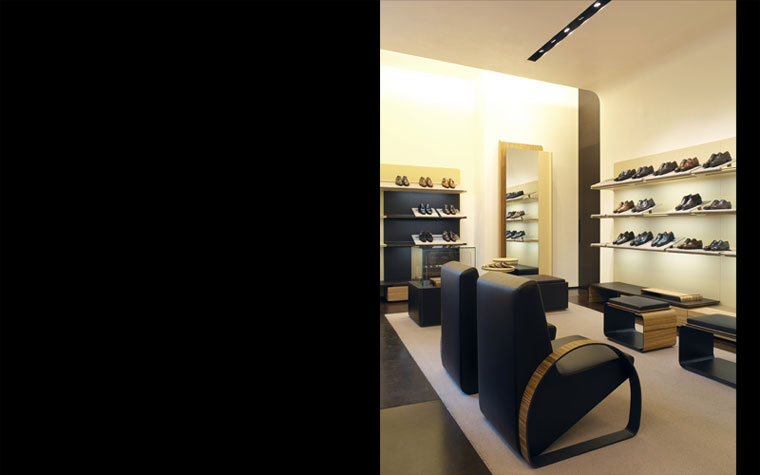
sutor mantellassi boutique
Location: Milan, Italy
Size: 100 sqm
Client: Sutor Mantellassi S.p.A.
Date: 2004
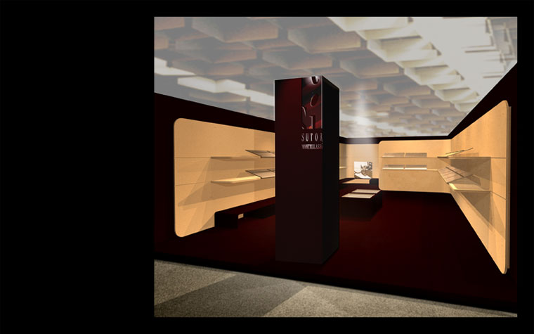
The guidelines of the Sutor Mantellassi concept originate from the craftsmanship and creativity of footwear, where the skilled overlapping of “layers” of skin and leather determines the volume of the shoes.
In fact, the main generator of this space derives from the use of thin overlapping planes, which like “skins” give rise to soft shapes where the curves negate any idea of sharp edges. These forms spring precisely from the world of artisan shoes, still hand-crafted, often with soft, rounded shapes and contrasting elements.
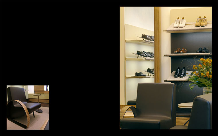
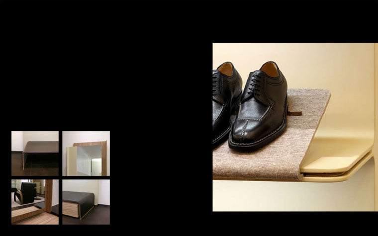
According to a criterion of contrasting light and dark, the chromatic hues of the leather exalt the display elements inside the boutique via the use of an array of different materials including light/dark brown skins, Zebrano wood, and beige felt and tobacco coloured leather.
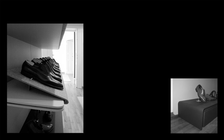
The display system on the walls consists of modular components lined in dark/light coloured leather, fitted with inclinable felt-lined shelves especially designed to display footwear, and Zebrano-wood stands equipped with pull-out drawers.
This allows the areas to acquire an elegant harmony with the objects on display and a “timeless” atmosphere, just like the Mantellassi creations themselves.
sutor mantellassi - showroom
Location: Milan, Italy
Size: 53 sqm
Client: Sutor Mantellassi S.p.A.
Date: 2004
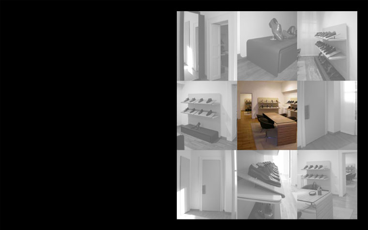
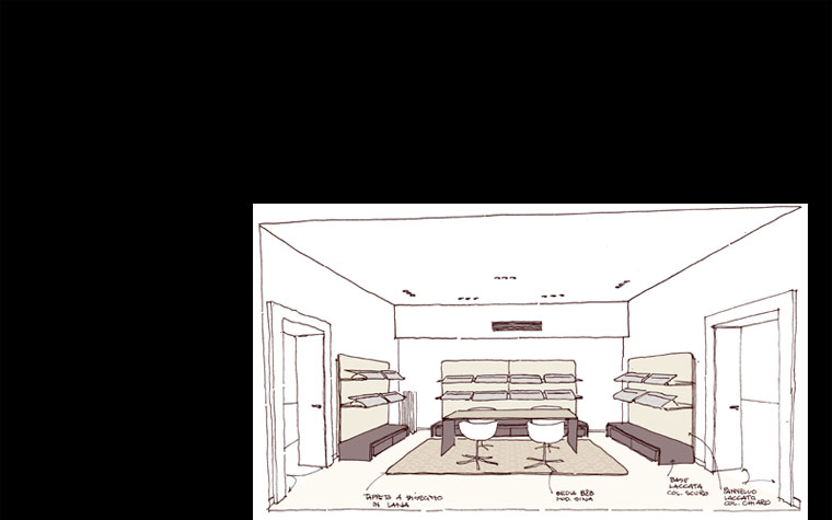
The Showroom of the artisan company Sutor Mantellassi that creates made-to-measure footwear is located inside a historic building in the heart of Milan.
The chromatic tones of the leather, in line with a criterion of light and dark, exalt the display features of the entire environment via the use of a range of materials: light and dark brown skin, African zebrawood, beige felt and tobacco coloured leather. Thanks to this combination of materials, the spaces blend in elegant harmony with the items on display in a “timeless” manner, just like all the Mantellassi products themselves.
The design choices, which are strongly influenced by the features of the product marketed by Sutor Mantellassi, are enhanced by flexible furnishings with soft lines characterised by warm colours and tactile materials like the felt lining the display shelves and the rugs identifying the office area.
sutor mantellassi - stand
Location: Florence, Pitti immagine Uomo, Italy
Size: 60 sqm
Client: Sutor Mantellassi S.p.A.
Date: 2005
This Stand concludes the itinerary for totally restyling the “Sutor Mantellassi” image that started off with the project for the new boutique concept and the creation of the showroom and boutique in Milan, and continued with the project regarding the coordinated image for the new logo chosen by Sutor Mantellassi (packaging, visiting cards, letterhead and internal stationery). Precisely on occasion of the Pitti Immagine Uomo 2005, Sutor Mantellassi was able to present a preview of its new coordinated image.
The Stand was conceived in the aim of presenting a “box” enclosing all the elements that characterise the new concept, the inspiration for which springs from the craftsmanship and creativity of footwear, with the skilled overlapping of “layers” of skin and leather.
The colours of the stand are the same as those selected for the company graphics and packaging, and the display features of the environment are exalted by the contrast of the darker shades of the container with the beige tones of the display shelves.
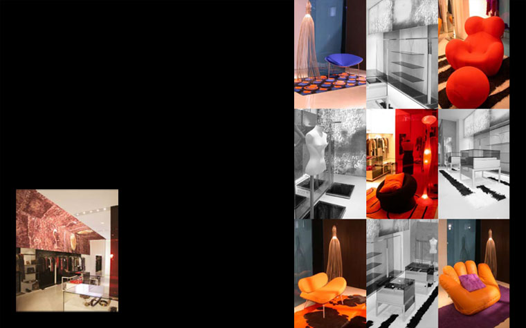
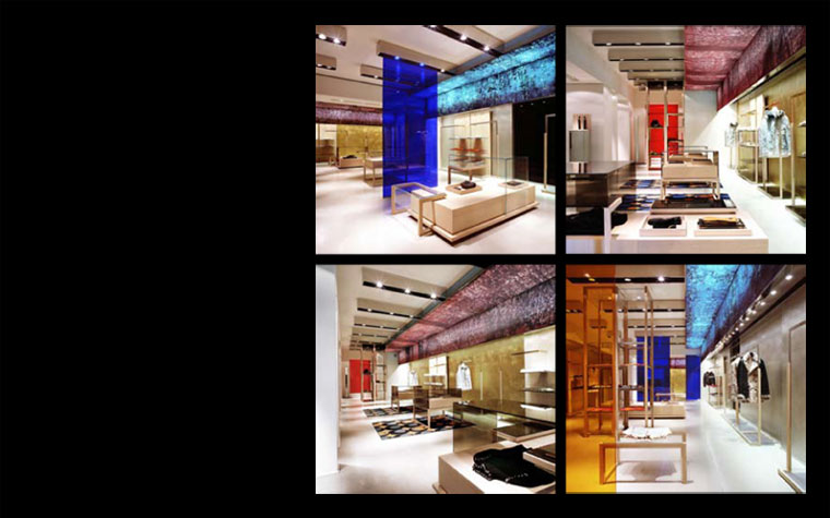
it store
Client: Ittierre S.p.A.
Date: 2005
Arising from the need to give an identity and image coherency to multi-brand boutiques, Concept IT expresses itself through a narration of constant compositional elements that are also capable of diverse linguistic innuendos, all in line with the surrounding environment. The colour is the main star of this chameleon-type process that is at the same time seductive, intriguing, functional, and aesthetically pleasing to the eye.
Artistic light-filled panels on the walls and ceiling, on which the images elaborated ad hoc by Tuscan artist Elisabetta Scarpini are printed, trace a guiding pathway and highlight the space, embellished by the gold and silver wall finish, while transparent coloured Plexiglas panels break up the area and central exhibition islands create alternating situations.
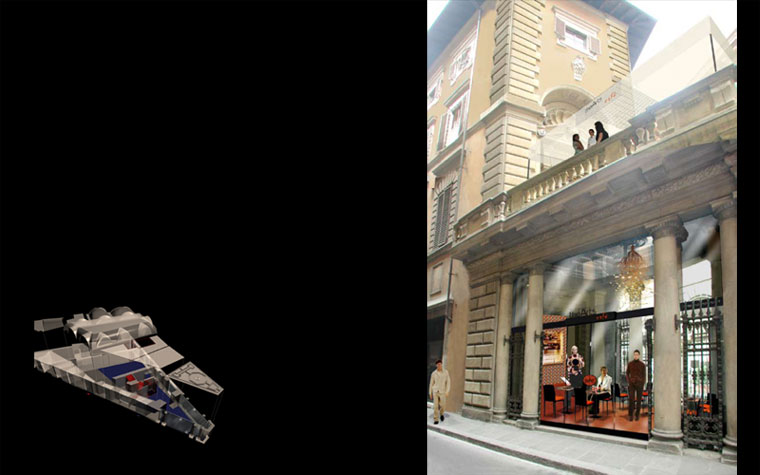
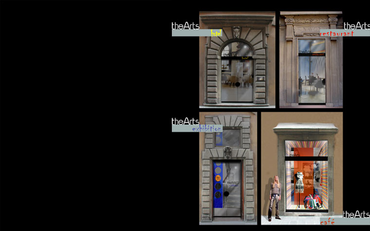
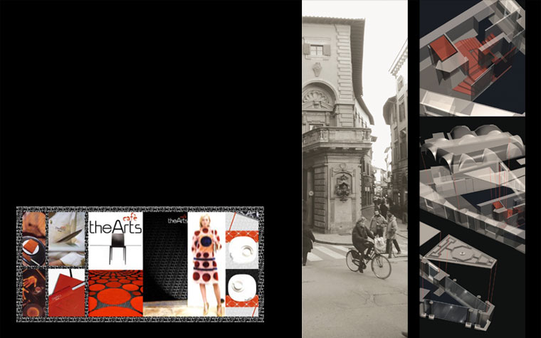
the arts
Location: Florence, Italy
Client: Ittierre S.p.A
Data: 2005
The project envisaged the insertion of various function on the different floors of the historic Palazzo Navone, located in the heart of Florence at the intersection between Via della Vigna and Via della Spada, with the front facing Via Tornabuoni in the direction of Piazza della Repubblica.
The basement is dedicated to temporary shows and exhibitions, the ground and first floors to boutiques with the possibility of exploiting the ample glassed-in loggia and terrace, while the top floors are reserved for hotel and incoming activities.
The concept for the coordinated image for “The Arts” brand has also been designed, including the logo and its applications for the Cafeteria, the Restaurant, the Hotel and the Department Store.